Thursday, 7 March 2013
Thursday, 30 August 2012
Sunday, 1 April 2012
Pumpkin Speed Sculpt
This is a speed sculpt I done on Halloween, took about an hour to do and I decided to render it a few days ago for fun.
and here's a sculpting time lapse
and here's a sculpting time lapse
Sunday, 5 February 2012
Ancient Ruins Final
I'm happy to announce I have finally completed my ruins environment! It's come a long way since the initial sketch, I played around with a lot of ideas and this is how it turned out...
Since my last update, I've completed the remaining assets (stairs, trim section and stone walls) I also added some extra visual interest for contrast.
I think the cool thing about working on personal stuff is that you can experiment and take the piece in whatever direction you want, especially if you start out with a loose concept and basic idea.
Here's a flat shaded image + wire...
I may get round to posting some more individual assets used in this piece but for now I'm quite excited to start a new environment piece and will update you guys when I'm on to something cool.
Saturday, 4 February 2012
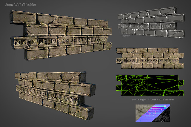
Tileable Wall Final
I've been working on finishing the wall asset I started the past week, I think it's a little on the stylized side but I'm still pretty happy with it and its fully tileable which is always great.

I'm planning to finish my ruins theme environment this weekend so check back soon to see the final finished piece!

I'm planning to finish my ruins theme environment this weekend so check back soon to see the final finished piece!
Monday, 30 January 2012
Brick Wall W.I.P
This weekend I had some time to work on my ancient ruins environment and started working on a high poly brick wall.
Base mesh was blocked out in maya and brought into zbrush for sculpting, I also experimented with some ivy wrapping around the bricks but not sure if I'll keep it. I still think I can beat the bricks up a little more and maybe add some noise to achieve a little more realism.
Anyway, I Should have a low poly ready soon and and texturing should bring it to life.
Monday, 23 January 2012
Bird Ninja
This weekend I was working on a character model for a client, I forgot how fun creating characters are.
It's going to be used as a prototype for a collectable figurine. I should have a picture of the 3d print soon and I'll post it up in the future.
Created in Zbrush & Maya, hope you like it!
It's going to be used as a prototype for a collectable figurine. I should have a picture of the 3d print soon and I'll post it up in the future.
Created in Zbrush & Maya, hope you like it!
Thursday, 19 January 2012
Ruins W.I.P
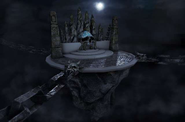
My progress on my ruins environment so far, just a quick update as I'm going to be taking a pause. As you can see I've changed some of the original composition by scaling up the pillars. I may also have to cut the bridge out of the project so I finish it quicker.
I'm probably going to revisit some of the textures becuase I'm not too keen on the blue higlights on the skull.
I chose a dark, night time setting instead of sunlight, just feel it suits the piece more and makes it more dramatic. The sharper specular highlight also worked with the night time lighting, like its been raining.
What I've got left to do
Brickwalls
Floor trim
Stairs
Foliage
The flat shaded areas are the pieces I have yet to finish.

Monday, 16 January 2012
Environment Asset - Pillar
I've been working on creating game res versions of my assets, I had a lot of trouble with the bridge cliff section, it just wasn't looking right and I wasn't settling for second best so I decided to revamp that section and include an ancient stone bridge built on top of the cliff. Still got some planning to do with that.
Anyway I started working on the pillar this weekend, I wasn't quite sure where I wanted to go with texturing my environment so working on this asset kinda defined what direction this environments going in.
Originally I wanted to go with a hell theme inspired by Mortal Kombat arenas, similar to my old one, but whilst texturing this pillar I came up with an ancient ruin theme, with lots of rocks, stones and greenery which I quite like and will see how it goes.
I've been jumping back and forth from texturing and modelling quite a lot as I don't really have a proper concept I'm following, just ideas in my head, but working on assets separately are helping shape this piece.
I'm going to be working on finishing off some more assets and the environment should start coming together quite soon!
Thanks for visiting!
Friday, 13 January 2012
Texturing Test
Here is a texturing test I've done, I usually jump around from modelling/texturing in my workflow, this way things are kept interesting for me and I can get an idea of texturing choices earlier on.
So I created my final low poly, tri count was just under my budget (500) at 499 tris. Then I wanted to see how the normal map would transfer, I done a few versions with various resolutions to see what was the best bake but finally went with a 1024 normal map.
I was also looking at the best solution for a diffuse map and decided to go with a 512 tileable texture combined with a 1k normal map to capture the main forms of the cliff.
For now I just threw on a procedural texture so that's not final yet.
After studying the first image, I came to the conclusion that the rocks looked a little soft and organic. To fix this I needed to accentuate the hard edges which I think pushed it a little further. I could still add some color variation, but I'll leave that till the final texturing pass.
So I created my final low poly, tri count was just under my budget (500) at 499 tris. Then I wanted to see how the normal map would transfer, I done a few versions with various resolutions to see what was the best bake but finally went with a 1024 normal map.
I was also looking at the best solution for a diffuse map and decided to go with a 512 tileable texture combined with a 1k normal map to capture the main forms of the cliff.
For now I just threw on a procedural texture so that's not final yet.
//UPDATE//
After studying the first image, I came to the conclusion that the rocks looked a little soft and organic. To fix this I needed to accentuate the hard edges which I think pushed it a little further. I could still add some color variation, but I'll leave that till the final texturing pass.
Subscribe to:
Comments (Atom)


